A portal application designed for 40,000+ residents who live in multi-family communities. The goal was to create a solution for people to be able to perform a multitude of everyday tasks related to living in their community.
Mobile app solution
Desktop website solution
The Problem:
The previous resident portal website was outdated, slow and cumbersome. Residents were complaining about the painful experience of paying their rent through the website, as well as the lack of modern features that other real estate companies offered their residents. Another enormous issue was the lack of mobile support. The mobile website was not dynamic or mobile-friendly, forcing users to choose between only using the solution on a laptop/tablet, or pinching to zoom in and out on their mobile device.
On top of this, there were problems with lack of connection to the internal enterprise software that the company’s staff used. The experience of the resident portal was very fragmented, and staff were often spending a lot of time manually making updates and changes on the internal end because the portal did not allow residents to make many changes on their own.
The Goals:
Rebuild the entire resident portal to produce a competitive solution that stands out in the multi-family home marketplace
Build an all-new mobile native app for both iOS and Android, as well as a mobile-friendly website
Enhance the experience of performing common tasks (paying rent, creating maintenance requests, etc.)
Improve overall customer satisfaction from mediocre to great
The Challenges:
Designing for a very broad demographic (a diverse group of many ages and different experience levels using apps)
Starting from scratch for mobile
Time constraints from executive stakeholders
Actively changing requirements throughout the process as required by the business
A global pandemic forcing pivots and adjusting the project scope
The Result:
Successfully delivered an all new desktop, tablet and mobile solution for residents to use and enjoy
Project was delivered on-time and met with high praise from the executive team and directors
Customer satisfaction was successfully increased, and the key pain points were fixed (5-star app ratings and praise from both residents and company staff)
The Team:
Lead Architect (Toronto)
VP of Customer Experience (Houston)
Customer Experience Manager (Houston)
Implementation Engineer (Houston)
Product Manager (Toronto)
Business Analyst (Toronto)
5 software developers (Toronto and Dublin, Ireland)
UX Designer (Myself, Toronto)
The Tools:
Figma, SurveyMonkey, Forms, OneNote, Excel, Outlook, Teams, Log Rocket, Confluence, Photoshop, JIRA
Here’s how we did it.
What was so bad about the old portal?
It’s difficult, or almost impossible, to be a leading company in your industry if your software solution(s) are outdated and difficult to use. This was the main hurdle that was facing the company and sparked the desire to have the portal redesigned and rebuilt.
The old portal lacked mobile support, as well as being generally outdated visually, and difficult to use. Originally designed in the early 2000’s by developers (no designers involved), it was overdue to be revamped. Residents were complaining about how difficult it was to perform the most basic of tasks. There were two glaring problems that needed to be fixed - we were making it too difficult to get money from our residents, and we made it too cumbersome for our residents to ask us for help. Our residents were happy to live in our apartments, but when it came to paying their rent, it was an archaic and friction-riddled experience. On top of this, doing other things like creating a request to have something repaired in your apartment was difficult as well. The form was too long and we asked too many questions that weren’t necessary to help them solve their problem.
The old payment process was outdated, slow, difficult to use and confusing
Users were greeted with this lengthy, word-riddled form with poor heuristics whenever they wanted to get help from us
Phase One: Researching for insights
Rebuilding an entire portal is a large undertaking, so it was critical that we started with solid research before we even began to think about starting a design. The first thing we needed to do was gather insights from current users about what they think about the current product. From there, we would be able to determine what their pain points are, what their biggest wants and needs are, and much more. We needed to hear directly from the users what their problems were so we didn’t waste time working on things that were considered low priority, which would not only be a waste of everyone’s time, but an expensive waste of resources.
A survey was created and sent to over 3,000 respondents, and the answers were aggregated and organized into a structure that could be easily digested by the stakeholders. We quickly learned that the top priorities for our users were being able to quickly and easily pay their rent, and being able to create and manage their maintenance requests. We learned that many of our residents preferred to call into the office to make a maintenance request rather than using the portal. That immediately let us know that we needed to make it quicker and easier for residents to do this themselves, taking pressure off our staff to manually perform these tasks over the phone.
Below are some quotes directly from our survey to users about their feelings about the payment experience and the maintenance request experience:
Some survey feedback about the current payment experience
Some survey feedback that highlights residents avoiding dealing with maintenance requests in the current portal
Another aspect of the surveys was to gather opinions from users about which features would be most important to them in the new and improved portal design. Additionally, we wanted to know how they felt about the portal overall so we knew where we stood in terms of an overall qualitative rating. Wanting to be industry leaders in our field, we were aiming for ‘greats’ rather than ‘goods’.
We decided to ask users what features would be of value to them in a new portal
While the current portal was meeting expectations, we were striving for more with the all-new version
Phase Two: Building the architecture
What needed to be improved upon for the new portal was quickly exposed and crystal clear after our rounds of research. We knew exactly what problems users were having, and we knew that we needed to focus on solving those problems to the best of our ability.
A key challenge was maintaining a strong balance between the business goals and the user goals. The business had features and ideas it wanted to see brought to fruition, but we also needed to make sure that these ideas were actually worth doing based on the research we’d collected. There would be no sense in adding a new feature that resident didn’t care for simply because the businesses wanted to be able to say “we have XYZ feature”. Once it was determined that the list of features the business wanted to see implemented was going to be of value to users, I was able to take the list of features and begin to work on the information architecture of the app through card sorting. Determining which features go where based on things like heuristics and competitor analysis was key to making this work properly. We wanted to ensure that our solution could do almost everything our competitors could do, but in an organized and logical fashion.
Card sorting was used early in the brainstorming sessions to help determine an architecture for the solution
Once the features were determined, they were consolidated into different sections of the app
To truly map out the steps that a user might take through the app to make a payment or create a maintenance request, user journey maps were created. These were used to quickly have a visual roadmap for how residents would journey through the experience, and allowed us to minimize friction as much as possible while they completed these tasks.
This journey map indicates the path a resident would take to create a maintenance request
Phase Three: High-fidelity prototyping
With the goals determined, the initial research completed and the information architecture in place, it was time to start creating the visual design of the app. I started designing the mobile version first, as it is easier to expand a mobile design into a web design rather than vice versa. We needed to stick with the brand of the company, and this included using the right colors and fonts provided by the marketing team. A design system was created to help manage components, which was an enormous help for developer handoff.
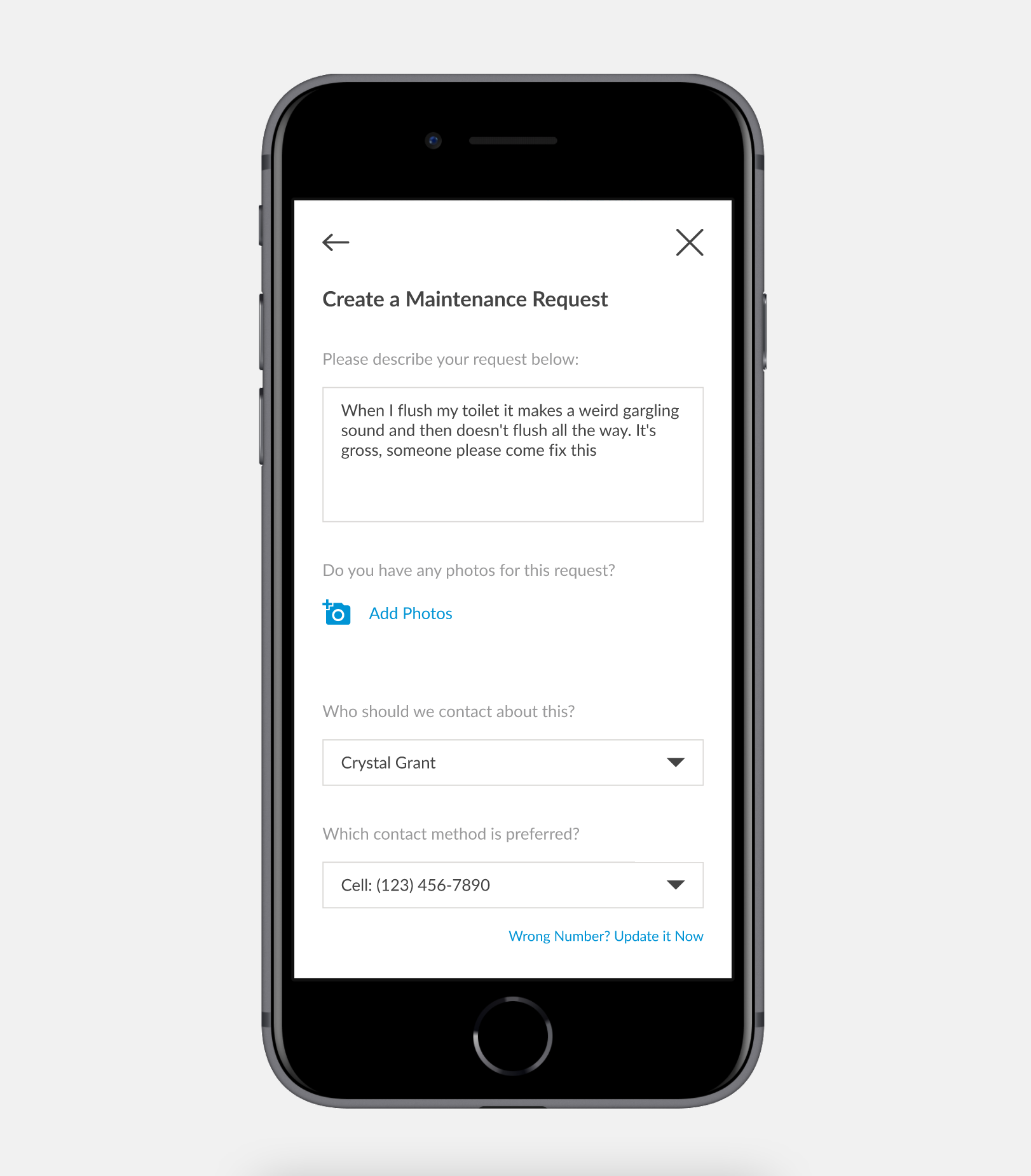
The new maintenance request screen was focused on simplicity and encouraging a quick and painless process
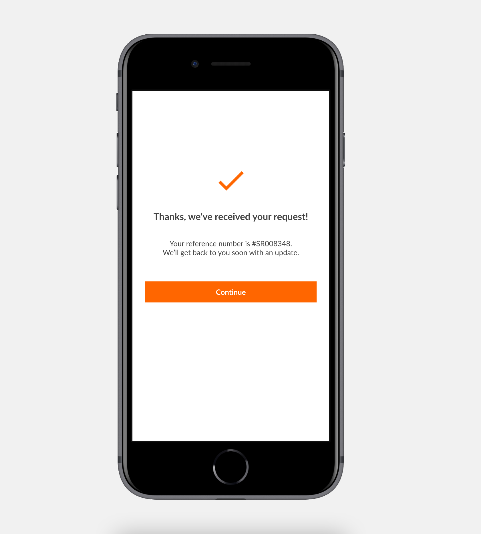
Submitted requests led to a confirmation screen to let the user know that help is on the way, with a reference number
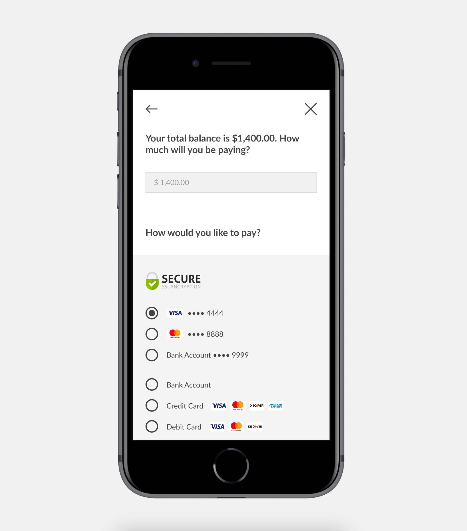
The payment experience was VERY improved to make sure that users had minimal friction while paying their rent
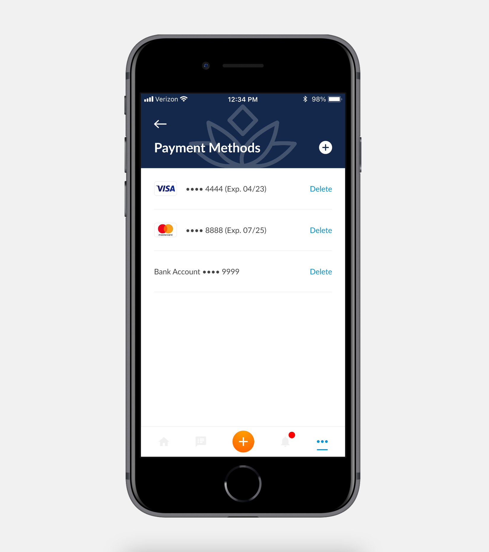
Users were now able to quickly and more easily manage saved credit/debit cards
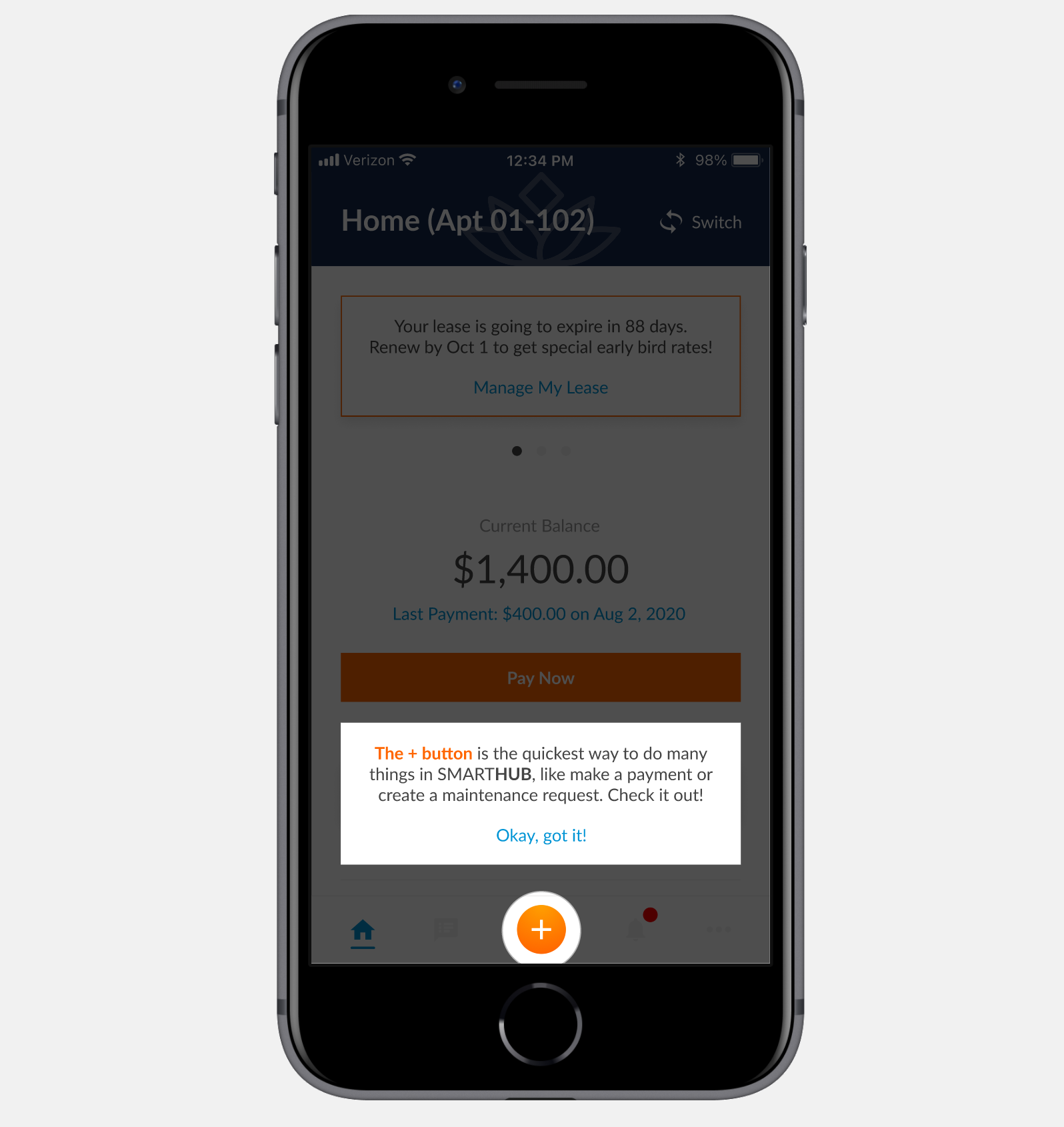
Tool tips were added to help onboard users smoothly and inform them of key features that improve usability
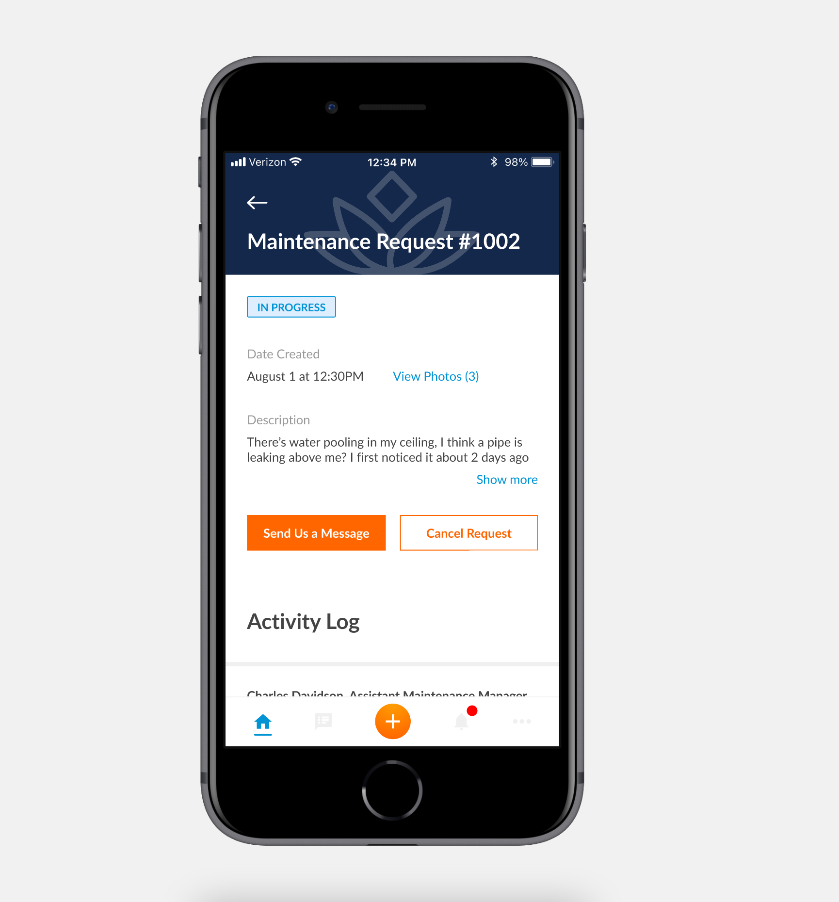
Users were now given an all-new way to manage their open requests, including a messaging system and an activity log of events that have occurred
A desktop and tablet version were also designed in unison with the mobile version. More screen space meant we were able to add more important information for the user without overwhelming them, and keeping much of the same usability patterns as the mobile version
Phase Four: User testing and gathering feedback
After the high-fidelity mock-ups were complete it was important for us to test our design with real users to make sure that our product was matching with their expectations. I randomly selected four users to conduct user testing in a face-to-face setting. All participants were given a phone with the interactive prototype to use. I asked a series of questions to each participant about their opinions on the app’s visuals, the log in and onboarding process, and the information architecture of the app. After gathering general feedback, I asked each participant to perform a series of tasks while I watched their action on the phone. Most tasks were able to be completed with almost no confusion or hesitancy, however there were a few key problems that quickly became apparent.
Some of the tasks I asked users to perform with the interactive prototype
The methodology that was used for the user testing session (fictional names were used to protect identities)
Some notes taken during a live user testing session
The success rates for each task the users were asked to perform during the test
After completing the user testing sessions, we were pleased to find that much of the design was well received. Users were able to complete many or all of the tasks with minimal complications. There were a few things we wanted to tweak, such as the fact that it took a few extra seconds for users to understand how to do certain things. The findings from the user testing session were invaluable, because it allowed me to not only see user perform tasks, but I was able to see their natural body language and facial expressions, which told a lot of the story about what they thought about the app and its usability.
The average rating for the overall usability rating for the prototype was 7.5/10 among all users. This was a great place to start, and we were able to take the qualitative and quantitative feedback back to the office(s) and begin to make changes based off our discoveries. Issues brought up by our users were broken down into two buckets: Critical Issues and Considerable Issues. We were then able to prioritize which problems to focus on solving first, and we began to brainstorm and discuss potential solutions to those problems.
Phase Five: Developer hand-off, product launch and success monitoring
Once the necessary tweaks and improvements were made to the prototype, the mock-ups were handed off to the development team of 5 amazing coders to bring our prototype to life. Countless hours were spent conversing with the developers, the business analyst, the product manager and the other high-level stakeholders to ensure that the product was being built the right way. Handoff to the developers was done through Figma, which allowed to them to easily view the visuals and export reusable components from the design system.
Launching the app was a huge undertaking that required a lot of planning, particularly by the implementation engineer and the marketing team. It was rolled out slowly to a handful of communities before eventually being rolled out to all communities, meaning almost 20,000 apartments and over 35,000 people. Overall, there were no major hiccups. Minor bugs and errors were quickly fixed, and we began the transition from launching to monitoring.
Log Rocket has been a helpful tool to help monitor and evaluate user sessions. We are able to see users screens as they use the portal, and we can also get many metrics about what people are doing and what problems they are having.
Log Rocket has been instrumental in giving us valuable user insights about usage
KPI’s were created and used as a measuring tool to ensure that the product was successful in the market
The app has been very well received and user adoption is steadily increasing
Which goals were achieved and what was learned?
I am proud to say that all the goals for this project were achieved! With almost 2 years of planning, designing and building (which was interfered with by the global pandemic), we were able to successfully rebuild the resident portal in a new and modern way that improves the user experience. Residents now have more autonomy to easily perform common tasks on their own, which takes pressure off our staff having to do it manually on the internal side. Not only that, but residents now have a mobile-friendly option unlike before. The project was delivered on time and has been well received by users overall! In addition, the company executives (COO and Chairman) were thrilled about the final product as well. As of writing this, we continue to make enhancements, fix bugs and strive to make the solution even better.
One of the biggest lessons learned was that our assumptions of what users prioritized weren’t quite accurate. We had assumed that our users were interested in an app with a wide array of exciting new features. We quickly learned through research that users actually just wanted the app to do a short list of very simple things. We plan to continue to work on making those simple tasks even easier to perform, while also enhancing the overall app by implementing other features to stay ahead of the curve. All of these decisions will continue to be made based off a solid foundation of user research and feedback.
The amount of effort and teamwork that went into this was truly amazing. From working in different time zones, juggling other major projects, organizing many moving parts, pivoting and adjusting scope, and going back to the drawing board several times along the way. Many weekly meetings were had, along with many ad-hoc meetings, and a lot of documenting was done as well to ensure all parties were on the same page.
The end result was a great solution that allows our users to do exactly what they want to do - perform tasks and solve problems in a very user-friendly way.
Thank you for reading! Feel free to explore my other case studies to learn more about the wonderful products I’ve contributed to.


